Friday, 15 September 2017
Monday, 4 September 2017
How to make use of Container View in iOS using Xcode 8 (implementing Page View Controller) ?
Container View in iOS using Xcode 8
In this tutorial blog, I am going to discuss about use of Container View in iOS application using Xcode 8.
Container View is used to manage multiple View Controllers into one View Controller. It is also referred as an approach to handle the multiple view controller’s content into single one.
While implementing Container View in a View Controller its child view controller automatically resizes according the container view size taken.
In below example, Page View Controller is implemented in a particular region of view controller and a child view controller i.e. page view controller automatically resized after making ‘embed’ segue from container view to child view controller as seen in screenshot.


Lets get started
Following are the steps to make use of Container View:
Step 1: Open Xcode -> click on Create new Xcode project then choose Single View Application template under iOS tab as shown in below image and click Next button.

Step 2: Enter the product name as ContainerViewDemo, select the Language as Objective-C and again click Next button as shown in below image. Later click Create button to create project appear on the next window.

Step 3: Adding Container View into the View Controller.
On your project, click on main.storyboard file available in the project navigator, and then select the Container View from object library, drag into the superview of View Controller, it will look like below.


Select View of View Controller and change its background colour from Attribute Inspector. Place two button named ‘Log In’ & ‘Sign Up’ as mentioned below screenshot to look UI better. (Optional)
Step 4: Delete Child View Controller to place Page View Controller
Select the child View Controller & hit delete button. Now, search Page View Controller from Object Library and drag & drop it to the storyboard. Thereafter, create ‘embed’ segue connection b/w Container View & Page View Controller by pressing Ctrl button & drag-drop method. It will look like below.

And also place another View Controller for showing the content of Page View Controller and that will be instantiated via Page View Controller.
Step 5: Create new class for Page View Controller & associate it
To create new class, press Cmd+N and select Cocoa Touch Class then click Next, give name of class as PageViewController & its superclass should be UIPageViewController, click Next.


After creating class, select controller & associate the class with it from Identity Inspector & type its class name in the field of Class.

In the same manner, create class for another View Controller where content of Page View will be shown, name it as ContentViewController & then associate the class as well.
Step 6: Adding Image View to Content View Controller
Search Image View from Object Library and drag-drop to Content View Controller then place it all over the view. Also define its property of IBOutlet using drag-drop method to class.

Step 7: Approach Page View Controller Blog Post or download Xcode Project.
In this step, copy the code of PageViewController class from Page View Controller blog post (link mentioned below) and paste it to its corresponding class in this project.
Similarly, copy the code of ContentViewController class and paste it to its corresponding class in this project as well.
NOTE: Don't forget to import images in Assets folder of xcode project.
Step 8: At last, run your simulator to test your app.

Have Fun !
You can also watch its video on below link:
Tuesday, 29 August 2017
Monday, 21 August 2017
Sunday, 6 August 2017
AUTO LAYOUT in iOS with Xcode 8 (Part-3) - STACK VIEW
STACK VIEW IN IOS
In this tutorial, we are going to discuss about Stack View, a part of Auto Layout. Let’s get started to discuss & implement Stack View into our application in Xcode 8.
When you need to set position for multiple views, auto layout is used where constraints are applied for multiple views but while modifying or updating that constraints become much complex. To reduce that complexity, Stack View is introduced to handle it out.
Stack View is a powerful tool and a part of auto layout which acts as a container for other views. UIStackView is a subclass of UIView. This Stack View provides grouping of elements in an organised manner. Elements can be organised using some of the following properties:
- Axis: describes for laying out view Horizontally or Vertically.
- Alignment: to align views perpendicular to axis of stack view.
- Distribution: defines the views to be sized.
- Spacing: defines the distance b/w the subviews of stack view.

Now, let’s get started to create new Xcode project for embedding Stack View and see how it works practically.
I have already made a sample Xcode project wherein I have taken multiple TextFields & Buttons and applied constraints on it without using Stack View.
Download the above sample project and save it in your Mac or Laptop. Thereafter, open it and proceed with the following steps.
Following are the steps to embed Stack View into Xcode project:
Step 1: Open Existing Xcode project (Sample Stack View project) from where you saved your downloaded sample project.
Now, here you will find some of the elements already taken and constraints are also applied without using stack view.

Step 2: Remove all constraints except Navigation Bar and Image View. Select all textfields and buttons then go to auto layout bar & click on Clear Constraints as shown in below screenshot.
Step 3: Embed Stack View in all TextFields & Buttons.
On your project, select all textfields first and click on Embed In Stack button from Auto Layout Bar available at bottom right side. You will see all textfields will come up in compressed manner.

Adding Constraints to stack view
Now, add constraints only to the stack view by following ways:
- Pin it to left and right, value 0.

2. Give its x-position to Centre Horizontally.

3. Set vertical spacing from stack view to Image View.

Thereafter, from stack view properties, set its Distribution property to ‘Fill Equally’ and Spacing to ‘20’ to make distance b/w textfields.

In the same manner, embed in stack for buttons and apply constraints to the stack view of buttons by pinning from left & right to value ‘0’ and bottom to value ‘20’. Also set vertical spacing from upper stack view by dragging method.


Step 4: Run Simulator
Hence you can now check your views using stack view in Simulator.

Hope you enjoy this video !
Have Fun !
You can also watch its video on below link:
Link to download sample project:
Saturday, 5 August 2017
Sunday, 30 July 2017
AUTO LAYOUT in iOS with Xcode 8 (Part-2) - Size Classes & Trait Collections
AUTO LAYOUT in iOS with Xcode 8 (Part-2)
In the previous tutorial of Auto Layout, we discussed only about Constraints. Now in this tutorial blog, we will discuss & implement Auto Layout Size Classes & Trait Collections into our application in Xcode 8.
Before moving to implementation part, let’s discuss first what is Size Classes ?
1. SIZE CLASSES
Size classes refers to categorisation of the screen sizes and orientation of all iPhone/iPad. Hence Interface Builder provides customisation of layout on the basis of current Size Class and further layout then automatically adapts when size class changes. Most Important, Interface builder by default use size classes.
Size Classes categories
There are two sizes for size classes: compact, and regular.
compact: meaning your interface is having shortest dimension.
regular: meaning your interface is having longest dimension.
With the above two terms, categories are as follows:
- Compact-Compact -> wC hC, where w is width & h is height.
- Compact-Regular -> wC hR
- Regular-Compact -> wR hC
- Regular-Regular -> wR hR
This category is known as Final Size Classes in which four size classes are there and also shown in below screenshot.

There is also a word Any like Compact or Regular. Any is generic size that works for all devices. Compact or Regular can be specified with Any which will create five more categories as follows:
- Compact-Any
- Any-Compact
- Regular-Any
- Any-Regular
- Any-Any
This above category is known as Base Size Classes and its abstract size classes which can represent two or more Final Size Classes. For Example - In Compact-Any size class appear in both Compact-Compact & Compact-Regular size views.
The following features can be set up using Size Classes:
- Views can be resized or repositioned.
- Fonts and colors can be changed.
- Constraints can be activated/deactivated (called installed and uninstalled).
- Views can be added or removed (also called installed and uninstalled).
2. Trait Collections
Trait Collection is the collection which defines Vertical & Horizontal size class, and display scale.
Varying for traits
Varying for traits is great for making more significant changes to a layout for a size class. Let’s explore varying for traits by adding a view and a constraint for different size classes in the sample application.
You may have noticed the Vary for Traits button at the right of the device configuration bar, and wondered what that button was for. Well, wonder no more! You can use the Vary for Traits button to start varying a layout just for specific size classes.
With an iPhone 7 device selected in the device configuration bar, select Vary for Traits. On clicking that button, two options will be appeared to vary for the width size class (wR), height size class (hR), or both (wR hR). In our case, select only height for landscape mode. When you make your selection, the device configuration bar will turn blue and you will see which devices and orientations you will be varying the layout for.


Now, let’s get started to create new Xcode project for implementing Size Classes and see how it works.
Following are the steps to implement Auto Layout Size Classes & Trait Collections:
Step 1: Open Xcode -> click on Create New Xcode project then choose Single View Application template under iOS tab as shown in below image and click Next button.
Step 2: Enter the product name as AutoLayoutDemo(Part-2), select any Language and again click Next button as shown in below image. Later click Create button to create project appear on the next window.

Step 3: Adding UIButton into the View Controller.
On your project, click on main.storyboard file available in the project navigator, then View Controller will be shown where you need to add button by searching from object library, drag into the superview of View Controller, it will look like below.


Now, select button and change its Background colour to ‘Blue’ & Text colour to ‘White’ just to look better. (Optional to you)
Step 4: Applying Constraints to UIButton using Layout Bar
As discussed earlier, to set the button at the centre, you need to define that four constraints: center horizontally and center vertically with its width and height as well. All constraints are with respect to the view.
For applying align constraints, select UIButton & then to add constraints for width and height by clicking ‘Adding New Constraints’ from layout bar, check Height and for width pin it from left and right & then click on “Add 3 Constraints” button as mentioned below.

After adding above 3 constraints, click the Align icon in the layout bar. In the pop-over menu, check only “Vertically in container” options. Then click the “Add 1 Constraints” button because width is dynamic so Horizontal position is not required.

After applying all 4 constraints, it look as can be seen in below image. Blue line indicates that constraints are applied successfully.
Step 5: Customising constraints of UIButton in Landscape.
Select UIButton then click on ‘+’ sign of Background property in Attribute Inspector. Now, for Landscape mode, width as Any and height as Compact should be selected as shown below.

Thereafter, choose any different colour (peach colour is selected). The above added property will be shown as mentioned below.

Step 6: Apply Vary for Traits for the landscape mode.
Now, you need to change orientation from Portrait to Landscape of View Controller.

Then click on Vary for Traits as appeared on right hand side.

After clicking on that button, two variations will be displayed - width & height. In our case, we need to only select height for landscape mode.

Thereafter, drag & drop a new button from object library to the view controller in landscape mode. Add the constraints as shown in below screenshots.


After adding all constraints to that new button, click on Done Varying to complete the trait collections process.
Step 7: Run Simulator to test result.
Hence you can now run the simulator to check the Buttons in Portrait as well as Landscape orientation.


Hopefully, this tutorial is helpful to you.
Enjoy ! Have Fun
Thursday, 27 July 2017
Tuesday, 18 July 2017
Wednesday, 5 July 2017
Introduction to Auto Layout in iOS with Xcode 8 (Part-1)
AUTO LAYOUT in iOS
In this blog tutorial of Auto Layout (Part-1), we will implement Auto Layout Constraints into our iOS application in Xcode 8.
Auto Layout is basically a concept which is used for laying out the UI elements in your iOS applications. It is used to create adaptive UI when screen size and device orientation changes. The size and position for all views are determined on the basis of constraints. More…
Main Components of Auto Layout are:
- Constraints
- Size Classes
- Trait Collections
Auto layout is a constraint-based layout system. In Constraints, there is two options to set constraints for a particular item - Auto Layout Bar & Control+Drag. So let’s get started to understand by creating new Xcode project.
NOTE: Size Classes & Trait Collections will be discuss in Part-2.
Following are the steps to implement Auto Layout Constraints:
Step 1: Open Xcode -> click on Create New Xcode project then choose Single View Application template under iOS tab as shown in below image and click Next button.
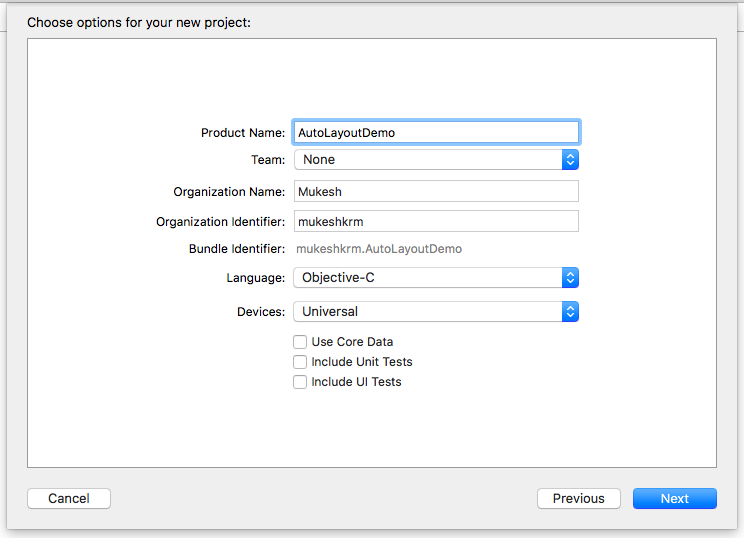
Step 2: Enter the product name as AutoLayoutDemo, select any Language and again click Next button as shown in below image. Later click Create button to create project appear on the next window.
Step 3: Adding UIButton into the View Controller.
On your project, click on main.storyboard file available in the project navigator, then View Controller will be shown where you need to add button by searching from object library, drag into the superview of View Controller, it will look like below.


Now, select button and change its Background color to ‘Blue’ & Text colour to ‘White’ just to look better. (Optional to you)
Step 4: Button Preview in all devices
Select Related Items icon -> Preview -> Main.storyboard (Preview) with pressing option key as shown in below image. Thereafter, preview screen will be appeared on right hand side in split way as shown in next image.


In Preview screen, we can add other devices by pressing ‘+’ button shown at the bottom to preview button as shown in below screenshot.

Now, as it can be seen that button is not at the centre in iPhone 7 Plus & iPhone SE while it is centered only in iPhone 7 because View is selected as iPhone 7 and button placed at its centre.
That’s why we use Auto Layout Constraints. Let’s discuss about the terms and ways of constraints.
Here you actually need to define following terms in constraints:
- Center Horizontally (x-position)
- Center Vertically (y-position)
- Width
- Height
Xcode provides two ways to define auto layout constraints:
- Auto layout bar
- Control-drag
1. Auto Layout bar
First, we begin with the auto layout bar. At the bottom-right corner of the Interface Builder editor, you should find five buttons. These buttons are from the layout bar. You can use them to define various types of layout constraints.

Each button has its own function:
- Update Frames - To update frame when constraints are applied.
- Embed In Stack – Embed views into a stack view. Stack view is a new feature since Xcode 7. We will further discuss about it.
- Align – Create alignment constraints, such as aligning the x-position and y-position of an object.
- Add New Constraints – Create spacing constraints, such as defining the width and height of a UI control.
- Resolve Auto Layout Issues – Resolve layout issues such as update constraints.
Step 5: Applying Constraints to UIButton using Layout Bar
As discussed earlier, to set the button at the centre, you need to define that four constraints: center horizontally and center vertically with its width and height as well. All constraints are with respect to the view.
For applying align constraints, select the UIButton in Interface Builder and then click the Align icon in the layout bar. In the pop-over menu, check both “Horizontal in container” and “Vertically in container” options. Then click the “Add 2 Constraints” button.

After adding above 2 constraints, add constraints for width and height by clicking ‘Adding New Constraints’ from layout bar, check Width & Height & type its desired values then click on “Add 2 Constraints” button.

After applying all 4 constraints, it look as can be seen in below image. Blue line indicates that constraints are applied successfully.
Now, you can again see the preview for the compatibility of its position in all devices.

Step 6: Applying constraints to another UIButton using Ctrl+Drag.
In Ctrl+Drag approach, we have two aspects: Align Constraints & Pin Constraints.
Here Align Constraints aspect is used.
After adding another UIButton, just press Ctrl button and release onto first UIButton (upper button), new pop-up will be display with multiple options as shown in below screenshots.


- Vertical Spacing: distance between both Buttons vertically.
- Leading: distance from left boundary of the view.
- Center Horizontally: to align x position at center of the view.
- Trailing: distance from right boundary of the view.
- Equal Widths: to set width same as existing Button.
- Equal Heights: to set height same as existing Button.
- Aspect Ratio: to control width & height ratio that you set.
Now, here I am using Pin Constraints aspect to set dynamic width/height or spacing between two UI elements / views.
In this case, I am deleting the second UIButton and work with first UIButton. Thereafter, also delete width constraint of existing UIButton from View Controller Scene as shown in screenshot.

For applying pin constraints, select the UIButton in Interface Builder and then click the Add New Constraint icon in the layout bar. In the pop-over menu, click left & right pin and also set its value to ’40’ then click the “Add 2 Constraints” button as shown in screenshot.

Step 7: Run Simulator
Hence you can now check the dynamic size of Button in Portrait as well as Landscape orientation in Simulator.


I hope you enjoyed this Blog tutorial.
Have Fun !
Subscribe to:
Posts (Atom)